Multifamily Blogs
Why Prospects Leave Without Booking a Tour and How to Stop Them?
Why Prospects Leave Without Booking a Tour and How to Stop Them?
Tours should be a click away, not a quest.
What if scattered tour options and unclear CTAs on your site are keeping prospects from their dream homes?
Consider this scenario: Linda, a prospect, is excited to tour your property but grows frustrated when she can't easily find her desired tour option. After countless clicks and wasted time, she questions if the in-person experience will mirror the complicated online journey.
Why It Matters:
Despite the fact that you have invested heavily in a broad range of tour options, a significant portion of your prospects are deterred from scheduling. The main reason? Scattered tour options! Given that 42% of multifamily professionals identify this as a stumbling block, streamlining with a One-Stop Portal is not just an option—it's a necessity.
What is a One-Stop Portal?
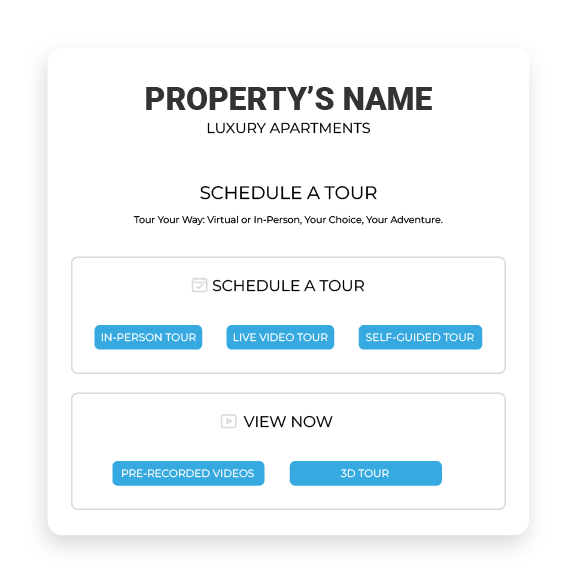
A One-Stop Portal is a centralized platform that brings together all tour options in a clean and organized manner.
By cutting through the clutter, it offers prospects a clear path to self-schedule their preferred tours.
With its focus on simplicity and ease, a One-Stop Portal bridges the gap between a prospect's initial interest and taking action.
How can a One-Stop Portal help you get more Scheduled Tours?
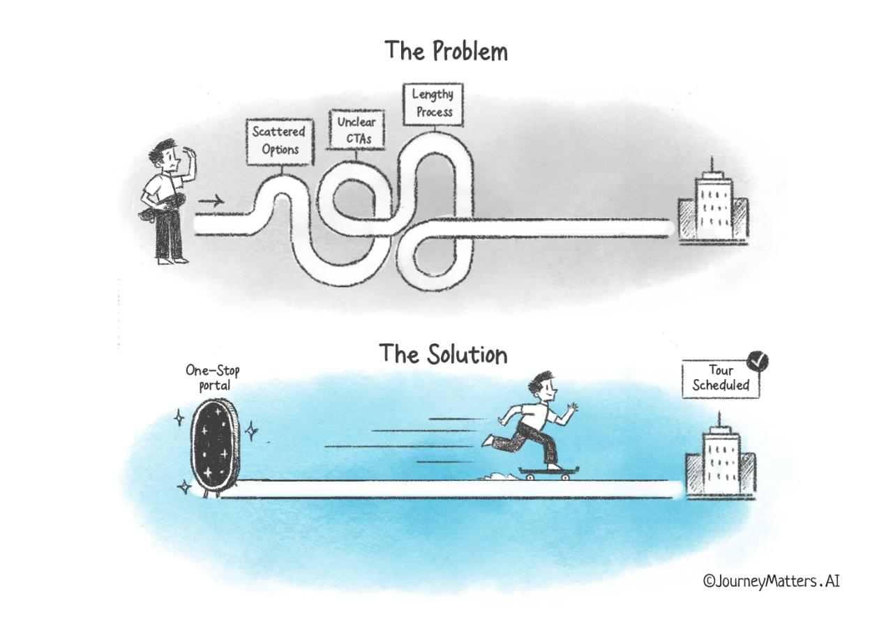
To understand the real value of a One-Stop Portal, let's explore how it effectively handles the 3 key challenges in securing tour bookings from your prospects.
1. Scattered Tour Options
Prospects are overwhelmed when tour options are dispersed across various sections of a site. This can make prospects feel lost, causing them to abandon their scheduling journey.
Solution: By adopting a One-Stop Portal, you allow prospects to view all tour options clearly and accessibly. A one-stop portal ensures that every available touring option, whether it's a 3D tour or an in-person visit, is just a click away. The ease of this process means prospects are more likely to commit and schedule a tour.
2. Complex Tour Selection and Unclear CTAs
Prospects need clarity. If they're presented with complicated choices and vague CTAs, they're bound to be discouraged.
Solution:
Simplifying is the way forward. In a One-Stop Portal, each tour option has a concise description. When prospects know exactly what they're choosing, satisfaction follows. Additionally, by prominently placing clear CTAs like "Take A Tour," prospects are guided seamlessly through their journey, reducing any uncertainty or confusion.
3. Lengthy Scheduling
In our fast-paced world, prospects value efficiency. If they have to spend unnecessary minutes—or even hours—trying to book a tour, they're likely to abandon the process.
Solution:
By streamlining the booking steps within the portal, you make it swift and hassle-free for users to finalize their tour. From the moment a prospect opts to schedule, a straightforward path should lead them to booking confirmation. With fewer steps and an intuitive interface, prospects are less likely to drop off midway.
Key Takeaways:
Navigating a property's website shouldn't feel like solving a puzzle. The right infrastructure, like a one-stop portal, can be instrumental in converting prospects to scheduled tours. It offers a seamless experience, eliminating key deterrents that currently stand in your prospects' way.
Remember:
- Centralized tour options enhance user experience.
- Clear CTAs drive user action.
- Streamlined scheduling minimizes drop-offs.
Ready to optimize your tour scheduling process? Embrace a one-stop portal today and see how fast prospects turn their interest into action.


