Multifamily Blogs
If You Don't Have Mobile Apartment Websites, Google is Coming for You.
If You Don't Have Mobile Apartment Websites, Google is Coming for You.

If you're one of those communities that has been putting off building mobile apartment websites for your communities, we have some bad news: Google isn't happy with you. According to a post at Search Engine Land, Google is now sending out warnings to webmasters whose sites are not mobile friendly. You can see a copy of the email and read Search Engine Land's take on it here.
What will this mean for apartment marketers?
Well, in their wonderfully euphemistic way Google has said that sites that are not mobile friendly will be "ranked appropiately." (Read: "If your site isn't mobile friendly, kiss your mobile organic search traffic goodbye.") This is a huge deal because you can't afford to disappear from the Google search engine result pages on mobile devices.
What does Google mean by "mobile friendly"?
Google has spelled out their mobile criteria in this post. Here are the four main points they emphasize when assessing a site:
- Avoids software that is not common on mobile devices, like Flash
- Uses text that is readable without zooming
- Sizes content to the screen so users don't have to scroll horizontally or zoom
- Places links far enough apart so that the correct one can be easily tapped
To illustrate what each of these points means, we've included screen captures with the post of websites that fail each of these tests.
Sites Using Software that is not Mobile Friendly
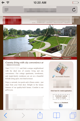
First, let's look at a site that is using Flash:

In this case, the whole site is Flash based, so none of it functions on mobile. In other cases you might see a site that only has certainl portions that run on Flash. In this case, there will simply be certain areas of the website that do not work properly. But in either case, it's a site that isn't functioning properly--so Google doesn't want to show it in their search engine results.
Sites Using Text Too Small to Read
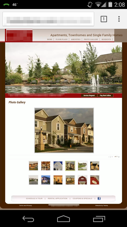
The second type of site Google warns about is one that has text too small to read on a mobile screen. The example below shows what this might look like in practice:

Again, this is a site that is basically unusuable on mobile because of the text, so Google doesn't want it ranking highly on mobile searches.
Sites that Fail to Size Content Appropriately
This is an issue with photos particularly--if users have to zoom in or out in order to view the photos on your site, this is another problem Google will dock you for. In practice it looks something like this: Note that the images are not sized appropriately for a mobile screen, which means you have to zoom in to see them clearly.

Sites with Links Too Close Together
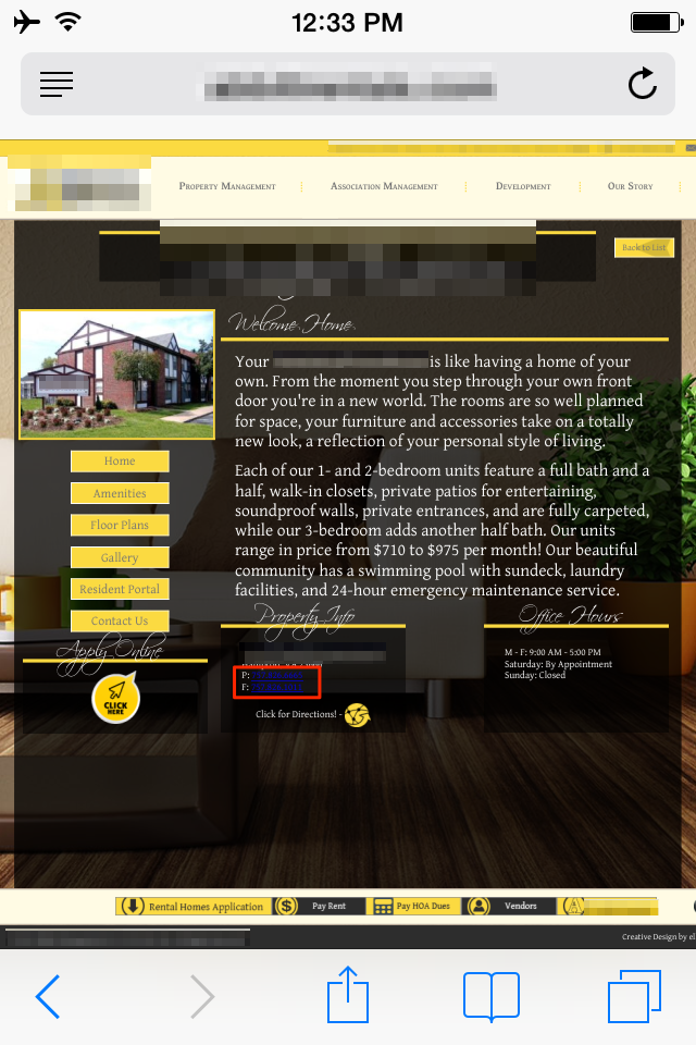
The final issue to discuss is with how sites display links. This issue crops up when you have multiple links on a page but the linked text is too small, making it difficult to select one link without inadvertently hitting another. We've indicated the place where this is the biggest problem with a red rectangle:

Conclusion
The important idea here is that this isn't something Google is doing simply to make life difficult for webmasters. As the images above should make clear, the sites they are targeting are sites that are genuinely unhelpful or difficult to use on mobile. So it only makes sense that a company built around providing users with helpful links would choose to not send their users to these sites. Thanks for reading!

