Multifamily Blogs
Brainstorming Lease Pricing Presentation Strategies
Brainstorming Lease Pricing Presentation Strategies
We talk a lot about lease pricing strategies, especially through revenue management systems. However, there is one aspect that could potentially be expanded upon, and that is the actual presentation of the pricing. I love looking at online services when it comes to pricing because they are able to test different pricing models much more thoroughly than we can. They have a much higher transaction rate, and they also have less variables because people are dealing static web pages versus much more dynamic human interactions. So they are often able to hone in on strategies to maximize the actual sale. In this example, I'm not debating how the price comes about, but rather how it is visually presented to the prospect.
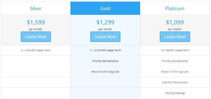
One of the common strategies you all have probably seen is the three pane option, where they have three different options presented to the customer. With each step up, additional benefits are included to sweeten the pot. Now to be fair, I have not seen studies on the effectiveness of this particular strategy, but I thought it was an interesting topic of conversation to see if it could be applied to multifamily. I could see this presented on a website, dynamically generated for each particular unit, shared on an ipad in person with a leasing consultant , or printed out.
So I want to share this mock-up below and let this be an open conversation.
- How do you actually present your pricing options to prospects?
- Do you think it is feasible to adopt a tiered system with different levels of perks?
- What perks could be added to create a system like this?
- Any other thoughts about visually presenting pricing to prospects?


